Thursday, 12 January 2012

Ancillary Tasks; Making the Magazine Article

To create our magazine article, we used photoshop. This is because it is a bit more advanced compared to the average paint that you get on the computers.
We started by getting an A4 plain document on photoshop, this would be our basic outline we followed to create the finish design

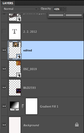
 Applying a white to black gradient helped create an affect in which we can work around. Having a variety of lightly coloured photos and darker ones meant that we were able to use this gradient to its full advantage.

Adding the images to the page. We wanted to go for a collage effect on the magazine article, however each individual picture would hide the one underneath it and so on and so forth. Therefore, to make it look more effective we changed the opacity of the image, making it a little transparent to blend the images together.

After we completed adding the images to the page (the above image), my group and I had the task of adding writing to the page and making it stand out to the audience. Also, because we wanted white writing, we'd need to put the writing at the bottom of the page as the gradient allowed the white writing to stand out.

The writing we included on the magazine article was conventional for this type of genre. We've included; the artist's name, the song title, how it would be available, websites and also a release date. The websites would help to build a fan base meaning that the artist would become (hopefully) globally known.

Tuesday, 10 January 2012

Ancillary Tasks; finished pieces

Magazine Article;
This is our final design for our magazine article. It's unique compared to other magazine articles. We based the idea of the writing on florence and the machines album release in 2009.
Opinions from audience;
I posted this image on some social networking sites to get opinions about our final magazine article. There was five questions that I asked. These were; 
'1. what you like about it?
2. what you dislike about it?
3. what you would change?
4. do you think it goes well with our theme?
5. does it attract your attention?
'
Asking these questions help us to know what we could do differently if we were to do a similar project in the future. Also, these are typical questions that would go through your mind when you are creating the magazine article


My own opinion;
1. The areas I prefer the most out of it all is the bold writing at the bottom of the page, it catches my attention and is clear to the audience of what it's about. 
2. The parts I dislike about it is the variety of different photos. It's good to have a variety however if they were in the similar era I think it would come together better.
3. I'd probably change the way it goes to darker/black at the bottom, I'm not too keen on it.
4. I feel  it goes well with the theme of the genre because it has images that fit in with the music video (for example the image of the dog, we have a dog running around in the music promo)
5. Yes it attracts my attention and I'd definitely go out and buy the CD.

Final Piece...

Carl Hauck; Windjammer


Audience Feedback; 


Carl Hauck's response;
"I really like the footage you filmed outdoors with you girls in it.  The old family photos are cool too.  The only odd thing for me was seeing someone else lip-syncing the song, but I’m guessing it’s probably fine to other people"

Click the below link to watch the audience feedback.