Friday 10 February 2012

4. How did you use media technologies in the construction and research, planning and evaluation stages?

iMovie: this technology was used to help us create our final production. Here we can edit, rearrange and remove items we don't want.
Photoshop: here we created our digipak and also our magazine article. This was a great technology to use because there was a variety of different technologies we could use to create an effective digipak
Final Cut: we used Final Cut to create different effects on our music promo.


We also used a variety of different technologies in which we received our feedback, these were mainly through the internet, however to present our feedback we used photobooth and iMovie.
Social Networking Sites: Social Networking Sites was used to gain feedback from the target audience. It is a great way in which we are able to gather information to help us take steps forward in the making of our production. It was also used after we had created all three items to our production.

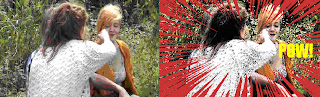
YouTube: YouTube was used to not only research for our final ideas but it was also the place in which we put our final production on. Here we can get a wide audience to gain feedback and to reach it's full potential. It was a great way to aim the music video at our target audience because YouTube is a world wide website. On the research side of it, it helped me to develop my ideas further and by discovering different music videos, it created visions that we could  use in our final piece.

Throughout my music promo I have learnt a variety of different shooting techniques, including from my preliminary task. I have used and developed skills created in my prelim to help my skills in the final production. For example, in my preliminary task we used stills to help bring across the point more clearly (as well used in my final production)


There were other areas that we had improved on, for example the mis-en-scene. The mis-en-scene in the prelim wasn't in the best of areas, and for example our count down scene was in front of a garage/shed door.
Taking this into account, we found that using more outdoor 'fresh' looking surroundings were a better look and the above image portrays a sort of industrial feel to the prelim, making it look 'tacky' because it did not suit the song we had chosen.

There were some issues that we had to address throughout the production, for example low lighting. Because throughout the filming we had bad weather, this affected the lighting, meaning the cameras couldn't pick up images better. Also, in some of the childhood memories, they are indoors, therefore we needed the correct angle of lighting to be able to see the images that we were trying to portray.To overcome low lighting in some of the footage, we made the brightness a bit higher on iMovie to be able to show the performer clearly. Also, as I said previously, indoor lighting was used to make the footage/photos stand out clearly. In some places, the brightness created via iMovie affected the original image making the original footage fuzzy, so in this case we had to resolve the problem another way (re-filming it or editing it in the way it didn't affect the image)


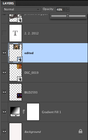
We used photoshop to create our magazine article and digipak. Here we had different technologies to help create our final pieces. In photoshop you can create different layers, this was helpful for our magazine article because we wanted to create a collage of the different photos we had gathered throughout our production. There were some difficulties to begin with because some of the images were darker than others, however create an under layer of black and white meant that we could lay out the images according to darkness.


Final cut was used to create an overlay of images in our music promo. Here we overlayed the pumpkin and the girl running through the woods dressed as ghost. These images are both to do with halloween and creates a good effect presented in our music promo. At first we found it difficult to use because we didn't know how to use final cut, and at times the images didn't load or save properly, however with a little help we overcame this problem.

There was a variety of diffents websites and storage areas in which I used to help bring my final idea together.
Blogger: I used blogger to demonstrate my research and place our final feedback from the production. This website helped me to keep everything together and managed to keep up to date.
Google: Google was used throughout the research stage. Here I found images for the storyboard and to also research other bands to help with the designing process.
Itunes: We used Itunes to store the song track in. Here we were able to transfer the track onto iMovie easily and place it in when needed.

4. How did you use media technologies in the construction and research, planning and evaluation stages?

We had to overcome problems at the beginning of our planning. This is because we could not use a song that had been copyrighted, therefore we used a website called www.unsigned.com


This website has a variety of different genre types that we could choose from. However my group and I already decided we wanted to do an acoustic genre based video. This narrowed down our problems of finding what type of song we wanted. We found Carl Hauck near enough straight away when looking and instantly began thinking what we could do for his song. The reason as to why we chose him was because he was different from other acoustic videos we had previously heard in the past. Also, his songs were slow, however they were not 'stupidly' slow.
To make sure we could use his song to produce into a music video we had to email him. This was his response;

Having reassurance from his licensing company that we could use his song, we began to plan. He also provided a link to his website which helped us get an idea of what Carl Hauck's image was about. His website is very simplistic however it related back to his genre type. The way in which it linked back to his genre type was because of the colour schemes he's used.

The colour schemes shown in this print screen shot demonstrate what I mean when I say he links back to the acoustic genre. In previous CD/Digipaks I have found that beige and most browns have been used, they link back to the colour of the instrument most acoustic artists play (guitar) and shows a sense of naturalistic.

3. What have you learned from your audience feedback?


My target audience for the music promo is people who prefer to listen to the acoustic genre. However, the acoustic genre is not everyone's 'cup of tea', so we are trying to also appeal to those people who may not listen to this particular genre. Also, we feel that we are aiming our music video toward people aged range between 18 - 40. This is because even though acoustic music is soothing and relaxing, we feel that Carl Hauck is more of the younger musician.


To enable us to construct our products, we had to create a questionnaire to receive feedback of what people like to see and what they’d prefer not to. By doing this we were able to work around the feedback to produce our final product. To receive our audience feedback, we asked face to face and on Social Networking sites (such as Tumblr and Facebook). The questionnaire below, is the questions we asked;

 We asked questions that what usually appear in a questionnaire, such as age and gender. These were just basic questions needed so we could see what different age groups liked what etc. However, we also asked questions that were related to the genre and by asking people what they think when they hear the song we choose, helped us get an idea of what we wanted to produce in our final product.

By doing this, we found out what percentage of people preferred what and how we could demonstrate their ideas throughout the music video. Even though the majority of people we surveyed were in the age range of 16-21, we still managed to get the information we needed to produce our final product.
-         Majority of people said that they expect to see close up/mid shots of the artist in an acoustic video.
-         1 in 3 (from Social Networking research) said they expect to see an old fashioned styled type video
-         75% of people surveyed expected to see an acoustic video either based in a woody area or in open fields
Baring these results in mind (and more) this could help us set out our location areas and also what people would vision the music video looking like.


We found that the majority of people that we received feedback from would prefer the setting to be in a rural location, with perhaps fields and trees in the background (taking it back to nature). We also found out that people would expect to see the guitar with the artist making this a typical convention of an acoustic genre music video. Finally, the way in which the performer should be dressed was based around the idea of our research and also our audience feedback. 


The second half of the feedback was developed after we had created our final pieces. To get this feedback I posted the final pieces on social networking sites (such as Facebook and Tumblr) and also posted the music promo onto YouTube to reach a wide target audience (the social networking sites were where our target audience was). We also received feedback from the artist that we used initially to see what he made of the promo. This was his response; "I really like the footage you filmed outdoors with you girls in it.  The old family photos are cool too.  The only odd thing for me was seeing someone else lip-syncing the song, but I’m guessing it’s probably fine to other people"


 As well as having people respond via internet, we also carried out a short questionnaire in which we recorded. These were the responses we got; 
Windjammer Music Promo Audience Feedback

2. How effective is the combination of your main product and your ancillary texts?

Our digipak also rolls in with the childhood theme. It includes images that may be seen throughout the music video however these are not screen captures because we wanted top quality images. It is conventional in the way it has been laid out (like most digipaks). However, I feel that this digipak is more unconventional because it does not relate to the artist himself and helps to create a warm feel to it. Having the photos link to the music video, helps draw the attention of the audience and perhaps even want them to re-watch the music video. The idea of the digipak is to make it stand out as well as possible without over doing it. With our title of the CD/DVD digipak, we used leaves and wrote on them. This is different to what is out there creating individuality to our work.

Each of our elements would be seen in different areas. For example the magazine advert would be seen in a music article, as it is part of advertising it would either be in the middle or back of the magazine. The idea of making a magazine advert is to make people aware of when a CD/album is coming out for the artist, therefore I would consider probably advertising this music advert in Q magazine because of the genre type of the artist.
Our digipak, I would recommend selling in a variety of different music stores, this may include HMV and also on itunes. This would make the CD/DVD digipak more known to everyone. Also, by placing the music video on YouTube you can now add advertising on there, so to make the digipak well known, I’d advertise the release date on the music promo.

2. How effective is the combination of your main product and your ancillary texts?

We completed the three different tasks. These are what they look like;
*add in digipak, magazine article and video*
Our magazine article I feel follow the conventions of a typical music advert. It is advertising the band clearly and has bold colours. It represents the song well because it is linking into the whole ‘childhood memory’. We based our idea around the ‘the flourence and the machine’ magazine article (demonstrated in the first question) where we took several points from it and also based our writing around it. Even though I’d say this follows the conventions of a typical magazine article, not many include a whole page image of collages. Therefore I feel that this is an unconventional side of it. We haven’t included a star rating however, it isn’t a very common thing in most adverts to show a star rating (it is not intended). Plus we felt including a star rating amongst the writing we’ve got already may make the page look ‘tacky’.  This article represents the song well because it fits in well with what we had created throughout the music promo.

The music video itself I feel is quite unconventional in a way that it’s different to what’s around. Even though there are one or two different music videos out there that have a similar theme attached to it, they don’t seem to carry it on throughout, whereas this music video does. *add in screen shots and talk about them*

1. In what ways does your media product use, develop or challenge forms and conventions of real media products?

Location wise we wanted more open areas to demonstrate child like actions (running around, having fun etc). Also, we wanted to film a few things that were indoors because they are either demonstrating when a child is going to sleep or Christmas/birthday. The locations we wanted to choose for the performance side were also outside because having a peaceful area around the performer is what we can see throughout other acoustic artists.

The location of this shot is rural Bourne. Even though there was a ‘no go’ in Bourne because it makes the video less realistic, we used the house highlighted for indoor usage. It is the perfect setting because the inside of the house is bright and spacious giving us a variety of different places to film. Here we planned to film the Christmas scene and Halloween (carving of the pumpkin).

Burghley house was the idyllic location for the performance side of the music video. Here there are large open spaces and wildlife that we could record and make fit in with the theme of our music video. With both bad and good weather we were open for ideas. For example there are a variety of different trees that we could ‘perch’ under.

1. In what ways does your media product use, develop or challenge forms and conventions of real media products?

There was a range of different areas that we needed to keep in mind when we were creating our music promo. For example one area we needed to cover was what the actors were going to wear to be able to portray that ‘childhood’ image. Also, we had to bare in mind what the performer was going to wear. For the performer, we looked at different acoustic genre artists to help inspire us.  My group and I always based our ideas around Ed Sheeran first, mainly because we all like him. The imaged displayed on the right shows a good idea on what we wanted our performer to wear. Being casual looking was what most acoustic genre artists looked like. So jeans (or chinos) a shirt (maybe checkered) and a laid back approach were what we need for our performer.


For the actors, we preferred if they dressed much more child like then they do now a days (for example hair tied back in pig tails etc). These images below display how we wanted our actors to look like to be able to show the audience the idea we had in our head and portray across the child like expressions.

1. In what ways does your media product use, develop or challenge forms and conventions of real media products?

However, as well as the videos that influenced our music promo, we had to think about what would look well on our Digipak and Magazine article. For this we studied a range of different magazines and Digipaks done by an acoustic band. There are a range of different items that are displayed on a magazine article. These are;
-         The band/Artist
-         Bold writing
-         The band/artist name
-         The title of their new album/song
-         The release date
-         How it is going to be produced (for example CD/Vinyl)
-         Details of the artists/bands websites (Facebook, official website etc…)
-         Reviews
-         Barcode
-         A price

   The Florence and the Machine magazine article (2009) influenced us because of the type of writing used. It was bold and stood out well amongst the image and black background. It also reflects back on the artists CD cover. The image in the middle stands out, and therefore we wanted to create something similar to this where the writing was eye catching and revealing to the target audience.

Even though this magazine article helped us a lot with our idea, we felt that doing a collage of different images would be more down the line we wanted to go. What inspired us to do this was the music promo itself. We wanted to make the magazine article and the music promo have a link and by creating the collage of old images kept the ‘childhood’ idea in mind.

 The Digipak I felt was the more difficult ancillary task out of the three things we had to do. This is because we have to advertise the CD and make it stand out to the audience (eye catching). No real CD/Digipak inspired My group and I however from the range of different Digipaks studied, we could pick out what was needed to be put on a Digipak;
-         The band/artists name
-         The title of the CD
-         A list of their songs
-         Perhaps something related to the genre (a guitar)
-         Or even an image related to one of their songs (old photos)
-         Barcode
-         Music/Company Industry Logo
An example of a Digipak that I found was this one from the band ‘festival’. It’s 
bright and colourful (it definitely caught my attention). It also has images of the band and what instruments they play. It’s a different layout compared to other bands because they have notes written on the inside (or perhaps even their songs). However something like this is to be kept in mind.

1. In what ways does your media product use, develop or challenge forms and conventions of real media products?


The print screen shots below show a direct comparison between music videos that are already out on the market and to our production.
Rizzle Kicks – When I was a Youngster http://vimeo.com/28639238


The idea of dressing up as a child came from this music video by the Rizzle Kicks. As we can see Abby is dressed up as a tiger in our music video and the Rizzle Kicks artist is dressed in an astronauts suit. Even though in the Rizzle Kicks video it’s about when they were younger and what they wished to be, it inspired us to create a childhood way.


Ed Sheeran – Lego House http://vimeo.com/30898113


During the music promo, we can see that there have been a range of shots used by the acoustic music genre. We’ve been able to use these shots effectively and they’ve managed to roll into one. Having a stronger narrative in our music promo emphasizes the lyrics without making it too obvious towards the audience. The narrative theory that would fit into what I am trying to say is the Roland Barthes - building a narrative. Action code = Refers to the other major structuring principle that builds interest or suspense on the part of an audience. The action code applies to any action that implies a further narrative action. 


The idea of our music promo was so that we didn’t want the video to go along with the lyrics. However, towards the end this has happened because we felt that it fit in with the story line. Using different effects on our music promo meant that we could demonstrate how home videos can bring childhood memories back to life. Other videos in the past have done this. Fading shots (such as cross blur) made the video run smoother.

However, as well as the videos that influenced our music promo, we had to think about what would look well on our Digipak and Magazine article. For this we studied a range of different magazines and Digipaks done by an acoustic band. There are a range of different items that are displayed on a magazine article. These are;
-         The band/Artist
-         Bold writing
-         The band/artist name
-         The title of their new album/song
-         The release date
-         How it is going to be produced (for example CD/Vinyl)
-         Details of the artists/bands websites (Facebook, official website etc…)
-         Reviews
-         Barcode
-         A price

Thursday 9 February 2012

1. In what ways does your media product use, develop or challenge forms and conventions of real media products?


The basic outline of the brief was to design and create a music video for an unsigned band. As well as creating a music video, we also had to create a magazine advert and also a digipak (or a website; however we decided against the website because no one in my group knew how to create one properly). The song I decided to choose for my production was ‘Windjammer’ by Carl Hauck. He is an acoustic artist from America and has a range of different songs that I could have chosen however I liked the feel of this song (a good vibe).


Each of these elements has a purpose in advertising the song and the artist themselves. A music video represents the artists’ skills and what they can produce. It also is a good way to demonstrate what the artist is demonstrating via lyrics. A music video is designed to make the audience want to replay it and catch their attention. The idea of the digipak is to present the CD/DVD that the artist is releasing. It has to be eye catching and also have some relation to what the artist/song is trying to portray. A magazine article (especially for an unsigned band) helps advertise to the fan base (or to even create a fan base. It helps to show the audience what is available and when.


Throughout my research, I discovered a large amount of different conventions in which are commonly found in music promos. The style of music video always varies depending on the type of genre that the band is known for. The image demonstrates a variety of different shots, editing techniques and locations that are commonly found throughout the music video industry.

Throughout our research, we have been influenced by a number of different music videos, ranging from artists like Ed Sheeran to Rizzle Kicks. Even though Rizzle Kicks isn’t an acoustic based band, they have some outstanding and effective music promos.

Thursday 12 January 2012

Ancillary Tasks; Making the Magazine Article

To create our magazine article, we used photoshop. This is because it is a bit more advanced compared to the average paint that you get on the computers.
We started by getting an A4 plain document on photoshop, this would be our basic outline we followed to create the finish design

 Applying a white to black gradient helped create an affect in which we can work around. Having a variety of lightly coloured photos and darker ones meant that we were able to use this gradient to its full advantage.

Adding the images to the page. We wanted to go for a collage effect on the magazine article, however each individual picture would hide the one underneath it and so on and so forth. Therefore, to make it look more effective we changed the opacity of the image, making it a little transparent to blend the images together.

After we completed adding the images to the page (the above image), my group and I had the task of adding writing to the page and making it stand out to the audience. Also, because we wanted white writing, we'd need to put the writing at the bottom of the page as the gradient allowed the white writing to stand out.

The writing we included on the magazine article was conventional for this type of genre. We've included; the artist's name, the song title, how it would be available, websites and also a release date. The websites would help to build a fan base meaning that the artist would become (hopefully) globally known.

Tuesday 10 January 2012

Ancillary Tasks; finished pieces

Magazine Article;
This is our final design for our magazine article. It's unique compared to other magazine articles. We based the idea of the writing on florence and the machines album release in 2009.
Opinions from audience;
I posted this image on some social networking sites to get opinions about our final magazine article. There was five questions that I asked. These were; 
'1. what you like about it?
2. what you dislike about it?
3. what you would change?
4. do you think it goes well with our theme?
5. does it attract your attention?
'
Asking these questions help us to know what we could do differently if we were to do a similar project in the future. Also, these are typical questions that would go through your mind when you are creating the magazine article


My own opinion;
1. The areas I prefer the most out of it all is the bold writing at the bottom of the page, it catches my attention and is clear to the audience of what it's about. 
2. The parts I dislike about it is the variety of different photos. It's good to have a variety however if they were in the similar era I think it would come together better.
3. I'd probably change the way it goes to darker/black at the bottom, I'm not too keen on it.
4. I feel  it goes well with the theme of the genre because it has images that fit in with the music video (for example the image of the dog, we have a dog running around in the music promo)
5. Yes it attracts my attention and I'd definitely go out and buy the CD.

Final Piece...

Carl Hauck; Windjammer


Audience Feedback; 


Carl Hauck's response;
"I really like the footage you filmed outdoors with you girls in it.  The old family photos are cool too.  The only odd thing for me was seeing someone else lip-syncing the song, but I’m guessing it’s probably fine to other people"

Click the below link to watch the audience feedback.