Friday, 10 February 2012

1. In what ways does your media product use, develop or challenge forms and conventions of real media products?

However, as well as the videos that influenced our music promo, we had to think about what would look well on our Digipak and Magazine article. For this we studied a range of different magazines and Digipaks done by an acoustic band. There are a range of different items that are displayed on a magazine article. These are;
-         The band/Artist
-         Bold writing
-         The band/artist name
-         The title of their new album/song
-         The release date
-         How it is going to be produced (for example CD/Vinyl)
-         Details of the artists/bands websites (Facebook, official website etc…)
-         Reviews
-         Barcode
-         A price

   The Florence and the Machine magazine article (2009) influenced us because of the type of writing used. It was bold and stood out well amongst the image and black background. It also reflects back on the artists CD cover. The image in the middle stands out, and therefore we wanted to create something similar to this where the writing was eye catching and revealing to the target audience.

Even though this magazine article helped us a lot with our idea, we felt that doing a collage of different images would be more down the line we wanted to go. What inspired us to do this was the music promo itself. We wanted to make the magazine article and the music promo have a link and by creating the collage of old images kept the ‘childhood’ idea in mind.

 The Digipak I felt was the more difficult ancillary task out of the three things we had to do. This is because we have to advertise the CD and make it stand out to the audience (eye catching). No real CD/Digipak inspired My group and I however from the range of different Digipaks studied, we could pick out what was needed to be put on a Digipak;
-         The band/artists name
-         The title of the CD
-         A list of their songs
-         Perhaps something related to the genre (a guitar)
-         Or even an image related to one of their songs (old photos)
-         Barcode
-         Music/Company Industry Logo
An example of a Digipak that I found was this one from the band ‘festival’. It’s 
bright and colourful (it definitely caught my attention). It also has images of the band and what instruments they play. It’s a different layout compared to other bands because they have notes written on the inside (or perhaps even their songs). However something like this is to be kept in mind.

1. In what ways does your media product use, develop or challenge forms and conventions of real media products?


The print screen shots below show a direct comparison between music videos that are already out on the market and to our production.
Rizzle Kicks – When I was a Youngster http://vimeo.com/28639238


The idea of dressing up as a child came from this music video by the Rizzle Kicks. As we can see Abby is dressed up as a tiger in our music video and the Rizzle Kicks artist is dressed in an astronauts suit. Even though in the Rizzle Kicks video it’s about when they were younger and what they wished to be, it inspired us to create a childhood way.


Ed Sheeran – Lego House http://vimeo.com/30898113


During the music promo, we can see that there have been a range of shots used by the acoustic music genre. We’ve been able to use these shots effectively and they’ve managed to roll into one. Having a stronger narrative in our music promo emphasizes the lyrics without making it too obvious towards the audience. The narrative theory that would fit into what I am trying to say is the Roland Barthes - building a narrative. Action code = Refers to the other major structuring principle that builds interest or suspense on the part of an audience. The action code applies to any action that implies a further narrative action. 


The idea of our music promo was so that we didn’t want the video to go along with the lyrics. However, towards the end this has happened because we felt that it fit in with the story line. Using different effects on our music promo meant that we could demonstrate how home videos can bring childhood memories back to life. Other videos in the past have done this. Fading shots (such as cross blur) made the video run smoother.

However, as well as the videos that influenced our music promo, we had to think about what would look well on our Digipak and Magazine article. For this we studied a range of different magazines and Digipaks done by an acoustic band. There are a range of different items that are displayed on a magazine article. These are;
-         The band/Artist
-         Bold writing
-         The band/artist name
-         The title of their new album/song
-         The release date
-         How it is going to be produced (for example CD/Vinyl)
-         Details of the artists/bands websites (Facebook, official website etc…)
-         Reviews
-         Barcode
-         A price

Thursday, 9 February 2012

1. In what ways does your media product use, develop or challenge forms and conventions of real media products?


The basic outline of the brief was to design and create a music video for an unsigned band. As well as creating a music video, we also had to create a magazine advert and also a digipak (or a website; however we decided against the website because no one in my group knew how to create one properly). The song I decided to choose for my production was ‘Windjammer’ by Carl Hauck. He is an acoustic artist from America and has a range of different songs that I could have chosen however I liked the feel of this song (a good vibe).


Each of these elements has a purpose in advertising the song and the artist themselves. A music video represents the artists’ skills and what they can produce. It also is a good way to demonstrate what the artist is demonstrating via lyrics. A music video is designed to make the audience want to replay it and catch their attention. The idea of the digipak is to present the CD/DVD that the artist is releasing. It has to be eye catching and also have some relation to what the artist/song is trying to portray. A magazine article (especially for an unsigned band) helps advertise to the fan base (or to even create a fan base. It helps to show the audience what is available and when.


Throughout my research, I discovered a large amount of different conventions in which are commonly found in music promos. The style of music video always varies depending on the type of genre that the band is known for. The image demonstrates a variety of different shots, editing techniques and locations that are commonly found throughout the music video industry.

Throughout our research, we have been influenced by a number of different music videos, ranging from artists like Ed Sheeran to Rizzle Kicks. Even though Rizzle Kicks isn’t an acoustic based band, they have some outstanding and effective music promos.

Thursday, 12 January 2012

Ancillary Tasks; Making the Magazine Article

To create our magazine article, we used photoshop. This is because it is a bit more advanced compared to the average paint that you get on the computers.
We started by getting an A4 plain document on photoshop, this would be our basic outline we followed to create the finish design

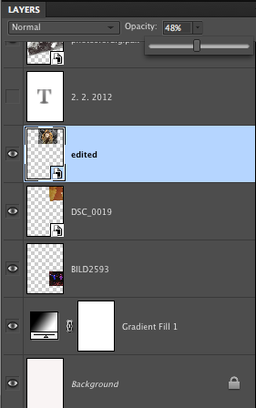
 Applying a white to black gradient helped create an affect in which we can work around. Having a variety of lightly coloured photos and darker ones meant that we were able to use this gradient to its full advantage.

Adding the images to the page. We wanted to go for a collage effect on the magazine article, however each individual picture would hide the one underneath it and so on and so forth. Therefore, to make it look more effective we changed the opacity of the image, making it a little transparent to blend the images together.

After we completed adding the images to the page (the above image), my group and I had the task of adding writing to the page and making it stand out to the audience. Also, because we wanted white writing, we'd need to put the writing at the bottom of the page as the gradient allowed the white writing to stand out.

The writing we included on the magazine article was conventional for this type of genre. We've included; the artist's name, the song title, how it would be available, websites and also a release date. The websites would help to build a fan base meaning that the artist would become (hopefully) globally known.

Tuesday, 10 January 2012

Ancillary Tasks; finished pieces

Magazine Article;
This is our final design for our magazine article. It's unique compared to other magazine articles. We based the idea of the writing on florence and the machines album release in 2009.
Opinions from audience;
I posted this image on some social networking sites to get opinions about our final magazine article. There was five questions that I asked. These were; 
'1. what you like about it?
2. what you dislike about it?
3. what you would change?
4. do you think it goes well with our theme?
5. does it attract your attention?
'
Asking these questions help us to know what we could do differently if we were to do a similar project in the future. Also, these are typical questions that would go through your mind when you are creating the magazine article


My own opinion;
1. The areas I prefer the most out of it all is the bold writing at the bottom of the page, it catches my attention and is clear to the audience of what it's about. 
2. The parts I dislike about it is the variety of different photos. It's good to have a variety however if they were in the similar era I think it would come together better.
3. I'd probably change the way it goes to darker/black at the bottom, I'm not too keen on it.
4. I feel  it goes well with the theme of the genre because it has images that fit in with the music video (for example the image of the dog, we have a dog running around in the music promo)
5. Yes it attracts my attention and I'd definitely go out and buy the CD.

Final Piece...

Carl Hauck; Windjammer


Audience Feedback; 


Carl Hauck's response;
"I really like the footage you filmed outdoors with you girls in it.  The old family photos are cool too.  The only odd thing for me was seeing someone else lip-syncing the song, but I’m guessing it’s probably fine to other people"

Click the below link to watch the audience feedback.

Saturday, 24 December 2011

Ancillary Task; ideas.

Album cover
This is the basic outline for what my group and I want the CD album cover to look like, however this is only the first sketch therefore it will end up changing throughout the coming weeks. We also have a magazine design to do.
The image below (of the leaves) shows our idea of what we want to put on the front album. It shows individuality because we used real leaves to write windjammer on.


Magazine
Here's a photo collage that my group and I have agreed on to have on the magazine cover.
Of course, it will look better than this, but the idea of having this on the magazine cover is that it will also link to the music video (as we have old photos flashing throughout) and also on the album cover, we are planning on putting on a few old photos.